
How does eye scanning impact visual hierarchy in Responsive Web Design?
about
In my final year of my Application & Media Development degree in a subject called 'action research,' we were to choose one topic to research for our ongoing assessment. I chose to research into how human eye scanning can influence a user experience so we can better design to guide the human eye through our digital medium to achieve our design result and communicate better.
The comparatively recent technology behind eye tracking is adding a new dynamic to how we visually perceive the world. This new science is helping us better understand and design websites that are both effective and aesthetically pleasing. Great interface design should be like an invisible hand that guides readers along at the speed of thought. To improve users experience we must enhance the effective communication of key information on a page. Understanding users viewing patterns can play an essential role in achieving this goal. This research aims to look at what visual hierarchy is and how it’s achieved, then examine how it works in relation to the natural movement of the human eye.
In a world dominated by technology, it has become imperative that user interfaces are designed in a way that guides the user through the content, communicating effectively in order to achieve the desired result. In responsive design, the user interface must maintain a visual hierarchy of content on all screen sizes in order to communicate content and call to action effectively. This research will add a new dynamic to how users perceive the web across multiple screen sizes.
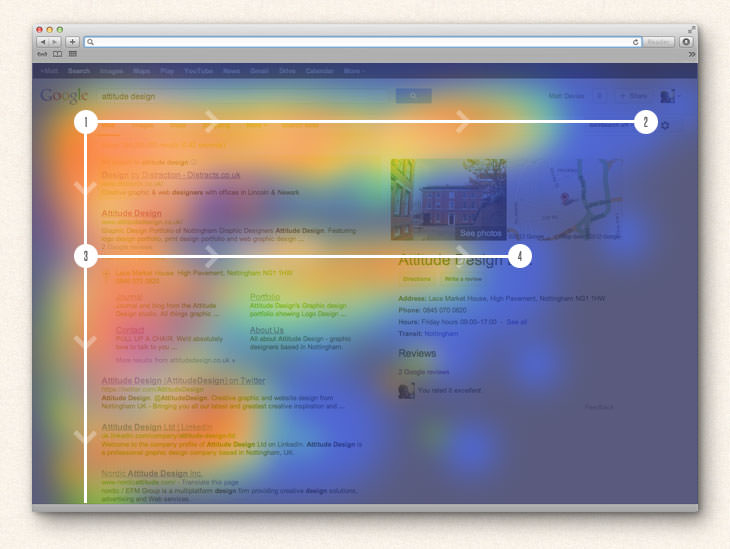
Recent studies have shown that people first scan a page to get a sense of interest before committing to reading it. Scanning patterns tend to take one of two shapes, “F” and “Z,” and this information can be used as an advantage when designing. F-patterns apply to traditional, text-heavy pages where the reader scans down the left side of the page, looking for interesting keywords in left-aligned headings or initial topic sentences, then stopping and reading to the right upon finding something of interest (Jakob Nielsen, 2006).

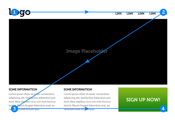
Z-patterns apply to other sorts of websites where information is not necessarily presented in block paragraphs, therefore the reader’s eye first scans across the top of the page then interchanges diagonally to the opposite corner, doing the same thing across the lower part of the page forming a Z like pattern (Brandon Jones, 2010).

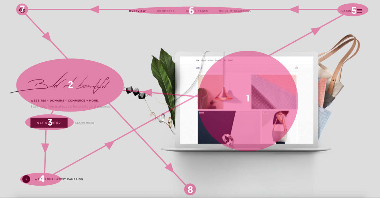
Visual hierarchies can override eye-scanning patterns shaping the way the user interacts with the page. These influences include elements such as size, space, texture, font weight, typeface pairing, colour, tint, direction, contrast, repetition, proximity, movement, and alignment. Results suggest that certain web components can affect how visually appealing a web page is perceived and the order of visual hierarchy.

Research indicates that Generation Y does not have a long attention span and further does not like reading large amounts of text. A recent study shows a negative correlation between the number of characters on a page and visual appeal (Djamasbi &Soussan, 2010). Heat maps can show us whether a web-page is successful in helping users find important entry points effectively and whether it encourages users to inspect the page thoroughly (Djamasbi &Soussan, 2014). Tracking data showed that users primarily fixated on large images. Because fixation is a reliable measure of attention, this data indicated that these characteristics attracted users attention (Djamasbi &Soussan, 2010). Fixation duration does not always indicate positive attention as longer fixations could also indicate confusion. For example, viewers may look at an interface longer if they cannot find their desired information (Djamasbi &Hall-Phillips, 2014; Poole &Ball, 2006). In this case, longer fixation durations and ratios may represent poor communication.
The research conducted has provided a knowledgeable and informative insight into the impact eye scanning and visual hierarchies have in web design. It has also provided valuable eye tracking data defining ways to guide the users through the website communicating call to action. From this we can look into how to better design digital screens to guide the human eye to the call to action or desired result and communicate better.
Annotated bibliography
Perugini, S., Dayton Univ., OH, and Ramakrishnan, N. "Interacting with Web Hierarchie." IT Professional 8, no. 4 (2006): 19 –28. Accessed March 22, 2017. http://ieeexplore.ieee.org.libraryproxy.griffith.edu.au
The article outlined the visual hierarchy used in Web site interfaces focusing on the analysis of interactive ecommerce sites. Several adaptive interface designs are emerging that support flexible navigation orders, exposing and exploring dependencies and procedural information seeking tasks. This article provides a context and vocabulary for thinking about hierarchy in website design also identifying three features that inform interface hierarchies. These are flexible navigation orders, the ability to expose and explore dependencies and support for procedural tasks. This article also talks about Ajax, a group of interrelated Web development techniques used on the client-side to create asynchronous web applications increasing user experience. The article helps explore visual hierarchy in website interface expanding on effective user interface practice and how the user interacts with the page. I find this journal article somewhat obsolete in the fast evolving world of web design due to the time gap in the year of publishing. The referenced site layouts in the article are most certainly out of date when compared to the standard of websites today. The article was informative in exploring dependencies in user tasks and visual hierarchy which relates to my studies on hierarchy and user interactivity determined by visual judgments. Such novel features will provide the next generation of interface options to support compelling interactions with Web hierarchies. Djamasbi, and Soussan.
"Generation Y, Web Design, and Eye Tracking." International Journal of Human-computer Studies 68, no. 5 (2010): 307. Accessed March 22, 2017. http://goo.gl/XXa8xm
This paper investigates the need for visually appealing websites focusing on Generation Y (age 18 –31) as a very large and economically powerful generation. The article explores the two separate studies using methods of surveys and eye tracking. Firstly, the online survey provides evidence that the proposed score for predicting the visual appeal of web pages reflects the self-report measure of what pages Generation Y likes. To refine these findings, an eye tracking study was conducted using the pages that were most and least liked in study one. Participants eye movements were tracked while browsing these pages, providing evidence of what attracts their attention. The results of these two studies suggest that Generation Y may prefer pages that include a main large image, images of celebrities, little text, and a search feature. As with any study, there were certain limitations. The online portion of this study was completed in a setting of the participant's choice; however, the setting and the potential for interruptions couldn ’t be controlled. The eye-tracking portion was, necessarily, held in a laboratory environment. A remote, unobtrusive eye tracker was used in a room designed to mimic a realistic office environment, decreasing threats to external validity. As the laboratory is not the participant's natural setting the findings are limited to the setting and the task. This research has important implications contributing to human –computer interaction literature, particularly visual appeal research. The findings in this study suggest that capturing users gaze may be a productive way of evaluating a stimulus as whole while simultaneously examining the relevant features. Targeting Generation Y with specific characteristics that improve the visual appeal of homepages will potentially lead to a higher rate of return and the attraction of more Generation Y users. With the advance of technology, targeting specific audiences is becoming more practical making it is easier to understand and appeal to a specific market segment.
Djamasbi, and Soussan. "Eye Tracking and Web Experience." AIS Transactions on Human-Computer Interaction 6, no. 2 (2014): 37-54. Accessed March 27, 2017. http://aisel.aisnet.org/cgi/viewcontent.cgi?article=1062 &context=thci
This paper thoroughly explores the User experience through eye tracking aiming to understand a user ’s point of view. Eye tracking allows us to literally see through a user ’s eyes, it can serve as a valuable tool in web studies, particularly in web design and development. To understand how eye tracking can be essential in website studies, this paper scientifically explains how the human visual system works and how eye tracking technologies can record what we register with our eyes. It then explains how web design can benefit from the data that eye tracking studies deliver. The paper discusses trends for eye tracking in future web experience research. It also discussed how fixation duration does not always indicate positive attention as longer fixations could also indicate confusion. Designing for positive web experiences is no longer a luxury but a must for staying competitive in today ’s business environment. Eye tracking can play an important role in designing successful and effective websites and as such relates to my research.
Ancy R. Glassman, and Phil Shen. "One Site Fits All: Responsive Web Design." Journal of Electronic Resources in Medical Libraries 11, no. 2 (2014): 78-90. Accessed March 27, 2017. http://www.tandfonline.com.libraryproxy.griffith.edu.au
Countless surveys and news reports have heralded the rise of mobile devices and the beginning of the decline of desktop computers. Although apps are useful, it is difficult to keep up with and maintain apps for the multitude of operating systems available. Responsively designed websites automatically scale to fit the user's device. This provides a platform to make websites available to the largest number of users and to keep them up to date. This paper explores the important implications of responsive web design as more devices and screen sizes are available for users to view the web ranging from phone, tablets, desktops, and even TV. The paper studies this by examining a responsive website and the way it interacts with the user on different devices. The paper also investigates development techniques optimizing load time, which also impacts the user experience. A limitation of this research is not investigating a variety of sites instead of focusing one example. The way the users eye scans a screen is subject to change depending on the device width. This must be taken into account when maintaining visual hierarchy on different screen sizes thus having a consistently optimized user experience that communicates effectively with the user.
Nielsen, Jakob. "Nielsen Norman Group." F-Shaped Pattern For Reading Web Content. April 17, 2006. Accessed April 26, 2017. http://www.nngroup.com/articles/f-shaped-pattern-reading-web-content
This report analyses results from eye tracking studies recording how 232 users looked at thousands of Web pages. The results found suggest that users main reading behavior was fairly consistent across many different sites and tasks mostly containing text heavy content such as blogs. This report discusses the F-reading pattern, which comes from the reader first scanning a vertical line down the left side of the text looking for keywords or points of interest in the paragraph's initial sentences. When the reader finds something they like, they begin reading normally, forming horizontal lines. The end result is something that looks like the letters F or E, which was visually depicted in the form of a heat map. Jakob Nielsen of the Nielsen Norman Group conducted elaborates on the practical implications of the F-Pattern. Users will rarely read every word of text meaning the first two paragraphs are the most important and should contain the hook. Starting paragraphs using, subheads, and bullet points with enticing keywords is also a practical implication that appeals to the users attention span. The research conducted is vitally important in understanding the impact eye scanning patterns have on visual hierarchy. The report demonstrated the most important content can be seen in a few seconds, with more detailed content and a call to action presented immediately below for quick scanning. The F-pattern can be very helpful for sites that want to embed advertising or calls to action in a way that doesn ’t overwhelm the content. As with all patterns, the F-Pattern is a guideline rather than a template because the F-pattern can feel boring after the top rows of the “F ”.
Jones, Brandon. "Understanding the Z-Layout in Web Design." Web Design Tuts. October 10, 2010. Accessed April 26, 2017. http://webdesign.tutsplus.com/articles/understanding-the-z-layout-in-web-design--webdesign-28
This article discusses the Z layout and the positive effects it has on visual hierarchy being guided by eye scanning patterns. Research suggests that the Z-Pattern tackles four of the main principles of an effective design being branding, hierarchy, structure and call to action. It works because most western readers will scan a site the same way that they would scan a book - top to bottom, left to right. This simple foundation offers flexibility in content allowing us to add multiple calls to action, shrink the height of the Z, extend it, and do what is necessary to attract the user to the result of the site. However this article concludes that regardless of any specific layout design, viewers are more likely to first look at the biggest, brightest, and most highly contrasted elements on a page first. Where the Z-Layout truly shines is in design projects where simplicity and a call-to-action are the most important principles. Trying to force a Z-Layout on a complicated content structure probably won't work well, but allowing the Z-pattern to form a framework for a very basic site can bring a sense of order that can help increase conversion rate. The paper fails to reference eye scanning studies, which leaves me questioning it ’s reliability though it has demonstrated the effectiveness of the Z-Layout and presented a effective understanding of principles. Attaining a better grasp of how different layouts can change user behavior is one of the central principles to creating an effective user experience.