

The principles of good logo design and how to apply relevant meaning
Tak Cheng Ng
When designing or redesigning a logo, It ’s important to not get caught up in the things that take away from the very purpose and function of what a logo is and what it ’s meant to do. A logos first job is to be a logo. Now, what ’s a logos job? To identify and represent a business, and its industry, on all sizes and media types throughout time.
Here are what I can best describe as the 6 commandments of good logo design:
Simple and minimal: the rule is it must be simple enough for any person to draw in 30 seconds (maybe up to 1min max). Like Nike, Apple, Target, Airbnb, and Pepsi. The simplest logos are the ones people remember the most.
Scalable: It is perfectly visible and legible at any scale. Good logos avoid thin lines as they fade out when small, effecting visibility and legibility. The same goes for logos that are too thick it all mushes together. A great logo should be simple enough to be able to be scaled down and still look crisp.
Versatile / Functional: A great logo should look equally good on any web device and on any kind of print material. Used in any way and in any colours.
Identifiable, Unique and memorable: Customers Identify your logo with your business and memorize it. A great logo should be impactful. You want to capture your viewer ’s attention and leave an impression (a positive impression, hopefully).
Relevant: A great logo should be relevant to your practice. It has to have meaning that relates to the work you are doing.
Timeless: A logo that withstands the test if time as good design. A design should last into the future.
Meaning, beyond what ’s relevant to the practice, does not fall under these commandments because it ’s not a requirement for a logo to succeed. Though when done right, implementing meaning creatively can help to set your logo apart and be more Identifiable with your business.
When it comes to conveying meaning in your logo, it should be visible and understandable to the consumer, because that ’s who your logo is for. The audience of your logo is your clients and customers and as a business, we must think about things from their perspective. Does it make sense from their perspective? Can a consumer or client look at your logo and see the meaning behind it - or would you have to tell them. A good logo is like a joke, you should not have to explain it - and if the punch line does not make sense it ’s awkward. I have seen business owners inject their own personal meaning into a logo no audience could understand but them at the expense of a functional good logo. Just because your aunt sue liked cats, does not mean it makes sense for your accounting firm logo to be a cat. Meaning is good when it 's relevant meaning, done well, that 's understandable to the target audience.
Things you should ask when designing a logo:
Does it appeal to my target demographic?
Does it look relevant to my industry?
Does it make sense from an outside perspective of a client or customer?
I wanted to show a logo that ticks all the boxes and shows the relevant meaning
![]()
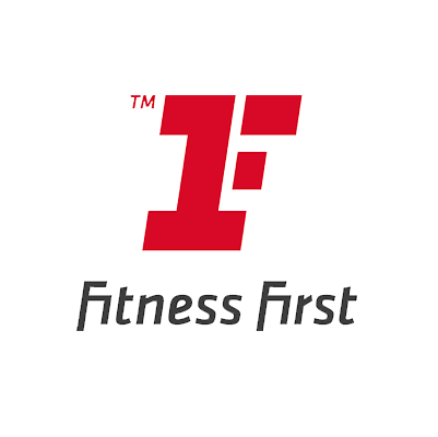
It 's simple, it 's scalable, It 's legible, it 's creative.
The logos icon relates directly to the name of the business and conveys meaning. The F in the logo is both an F and a 1 with speed.
What 'important to take from this is this is to first and foremost think about the purpose and function of a logo and how it will serve your customers in identifying your business. A logo and brand is a foundation of a good business that will carry it forward into the future as the business expands. A successful logo is a business 's best asset.